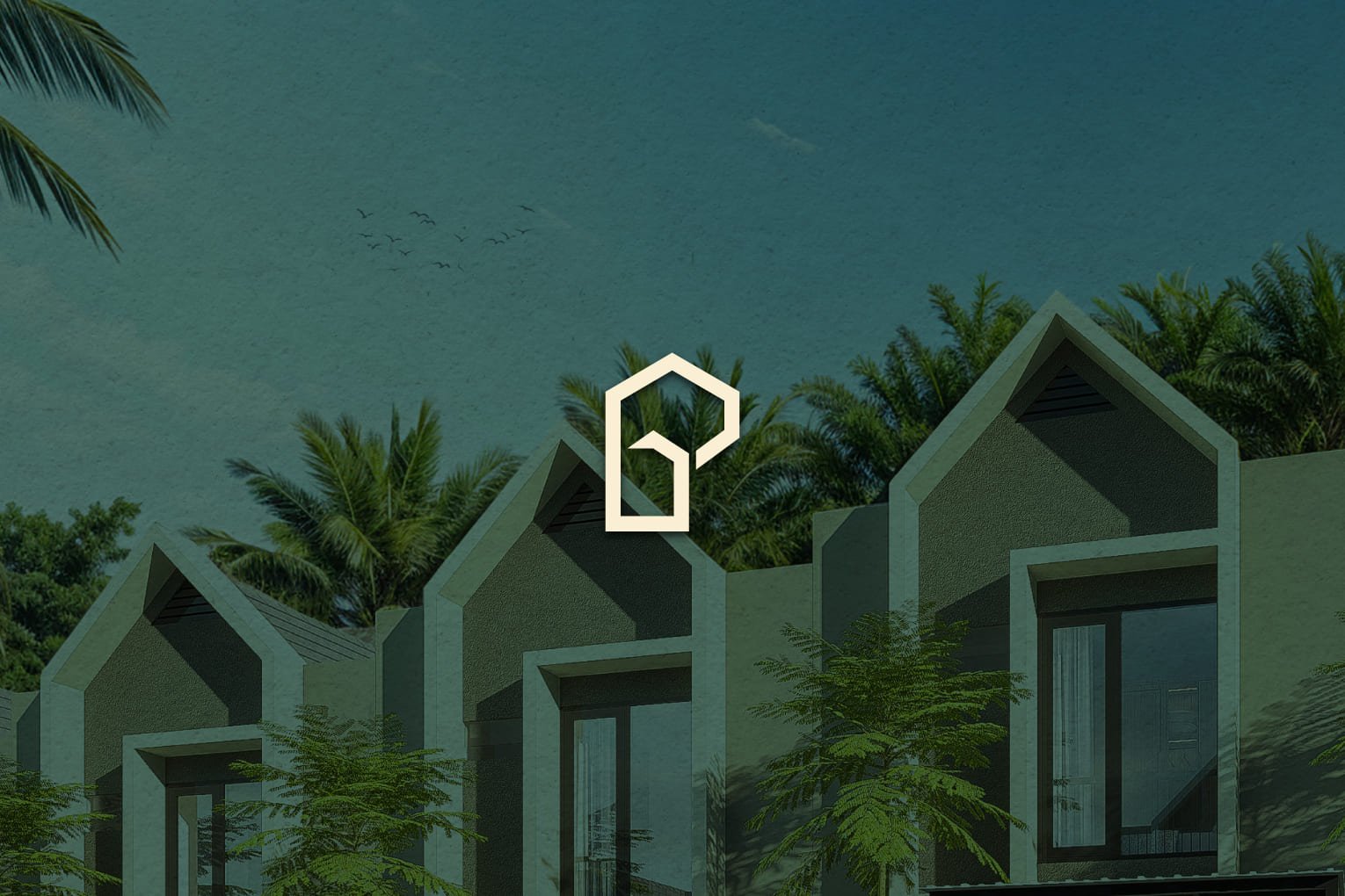
Pandara Land

PANDARA LAND BRAND IDENTITY DEVELOPMENT
Pandara Land is a premium hillside residence in Gresik, offering exclusive villa-style living. Our collaboration focused on creating a refined brand identity that embodies premium, tranquility, and growth, ensuring a strong and lasting presence.

COLORS
The brand’s color palette reflects harmony with nature, featuring deep green (#002C22, #003D31) for stability, fresh mint (#55D0A3) for growth, and soft cream (#FBF2DA) for warmth, reinforcing Pandara Land’s premium and serene identity.

TYPOGRAPHY
The primary typeface, Elza, offers a modern and sophisticated feel, while Urbanist and Brittany Signature complement the visual identity with a balance of clarity and elegance. This combination enhances the brand’s exclusivity and contemporary appeal.

COLLATERALS
From brochures to digital assets, every element in Pandara Land’s branding maintains a consistent premium and aspirational tone. The carefully designed marketing materials communicate exclusivity while immersing potential homeowners in the hillside premium experience.

