Ibu & Kakak

IBU & KAKAK BRAND IDENTITY DEVELOPMENT
Ibu & Kakak is a mobile catering service bringing authentic Indonesian flavors to special occasions across Arizona. More than just food, it’s a tribute to tradition, love, and shared moments. With high-quality ingredients and rich heritage, we designed this brand to feel as warm and inviting as a home-cooked meal.

INSPIRATION AND MEANING BEHIND THE LOGO
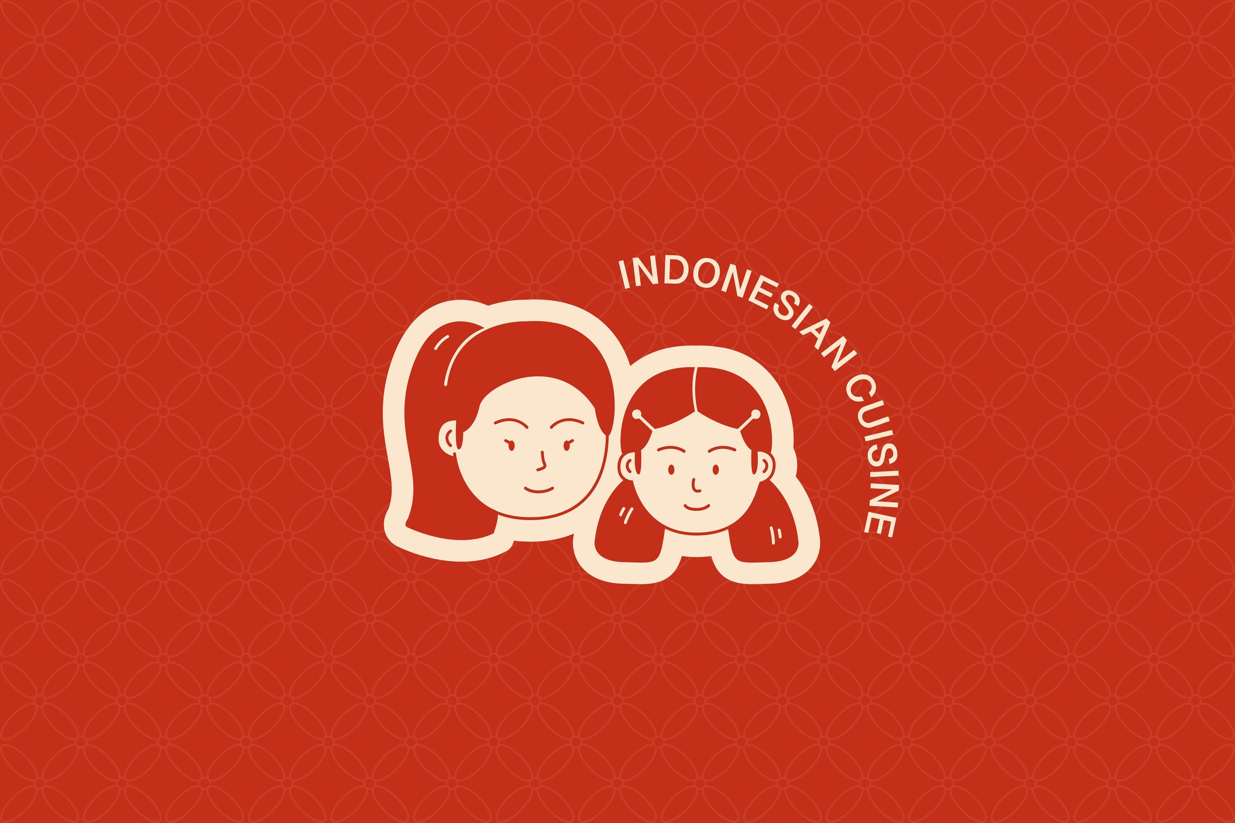
The Ibu & Kakak logo embodies family, tradition, and home-cooked comfort. Inspired by the Mother-Child symbol, it reflects their bond and love for Indonesian cuisine. The cactus tree, representing Arizona’s resilience, signifies their journey in sharing these flavors with a new audience, creating an authentic and welcoming identity.


COLORS

TYPOGRAPHY


COPYWRITING
Ibu & Kakak uses English for a refined brand voice while keeping its Indonesian roots in the name. The copy highlights authentic cuisine in the USA, emphasizing fresh, high-quality ingredients and a commitment to wholesome cooking.

COLLATERALS

IBU & KAKAK’S BRAND GUIDELINES
To ensure consistency, we developed brand guidelines that protect Ibu & Kakak’s identity. These guidelines maintain the proper use of each brand element, preserving visual integrity and preventing any inconsistencies.
