Casa Varya Brand Identity Development

Casa Varya Brand Strategy & Brand Identity Development
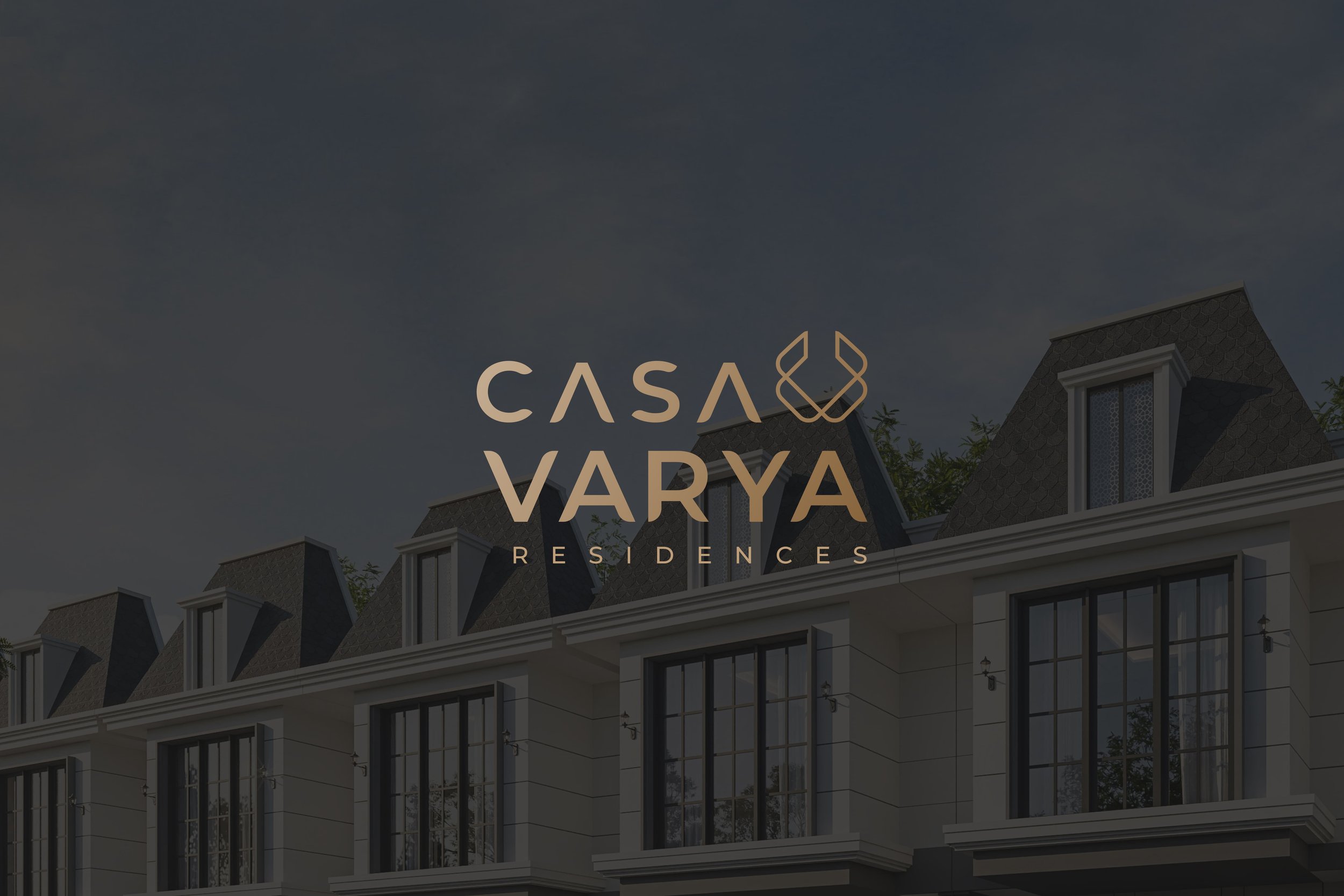
Casa Varya Residences is one of Mudaya Land's premier projects. As an affordable luxury housing option, it aims to establish an elegant yet modern brand identity to effectively reach its target market.


Casa Varya Logo Inspirations
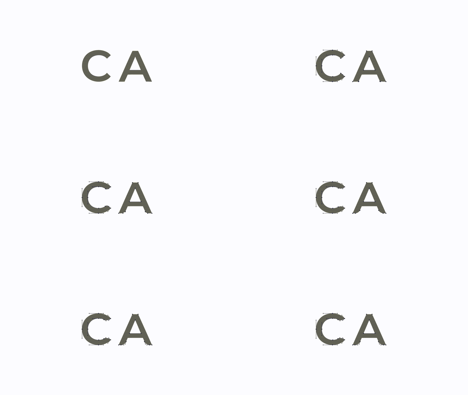
The inspiration for the logotype and logo icon comes from the letters C for ‘Casa,’ V for ‘Varya,’ and the roof of a house. The combination of C and V is visible in the logo icon, while the roof of a house is reflected in the A of the CASA logotype. Overall, the logo icon and logotype create an elegant yet straightforward brand identity for Casa Varya Residences.


Casa Varya Brand Colors
Khaki, Lion, Coyote, and Beaver are the predominant colors as they represent success, affluence, and luxury. Dim Grey and Gray symbolize authority, strength, and reliability, making the primary colors stand out more effectively.

Typography
In the Casa Varya logotype, a sans-serif font is used, featuring simplicity and clean lines that enhance its clarity and professionalism while conveying a sense of modernity and minimalism.


