


tuumbooh is a family-owned property development and short-rental villa management company in Jimbaran, Bali, Indonesia. tuumbooh aims to be the pioneer of authentic and serene living experiences in Bali. They envision crafting villas that embrace simplicity, immersing guests in the island's culture, fostering meaningful connections, and offering a peaceful getaway.
Our collaboration with tuumbooh aimed at translating this ethos into a visual identity that resonates with their core values. Unlike other property developers, tuumbooh's uniqueness lies in their dedication to creating villas that celebrate the beauty of humble and serene living. They offer a genuine and welcoming atmosphere, where guests forge meaningful connections with Bali's culture and its people, all within a tranquil retreat.
During the research and conceptualization phase, we assisted tuumbooh in discovering its distinct name.
In Bahasa Indonesia, 'tuumbooh' emerges as a symbol of growth, and stems from the word 'tumbuh,' which means 'grow' in English. The intentional alteration of the spelling, with double 'u' and double 'o,' crafts an identity that stands out.
The entire name carries the spirit of growth, and this theme seamlessly extends to the logo and overall brand identity.
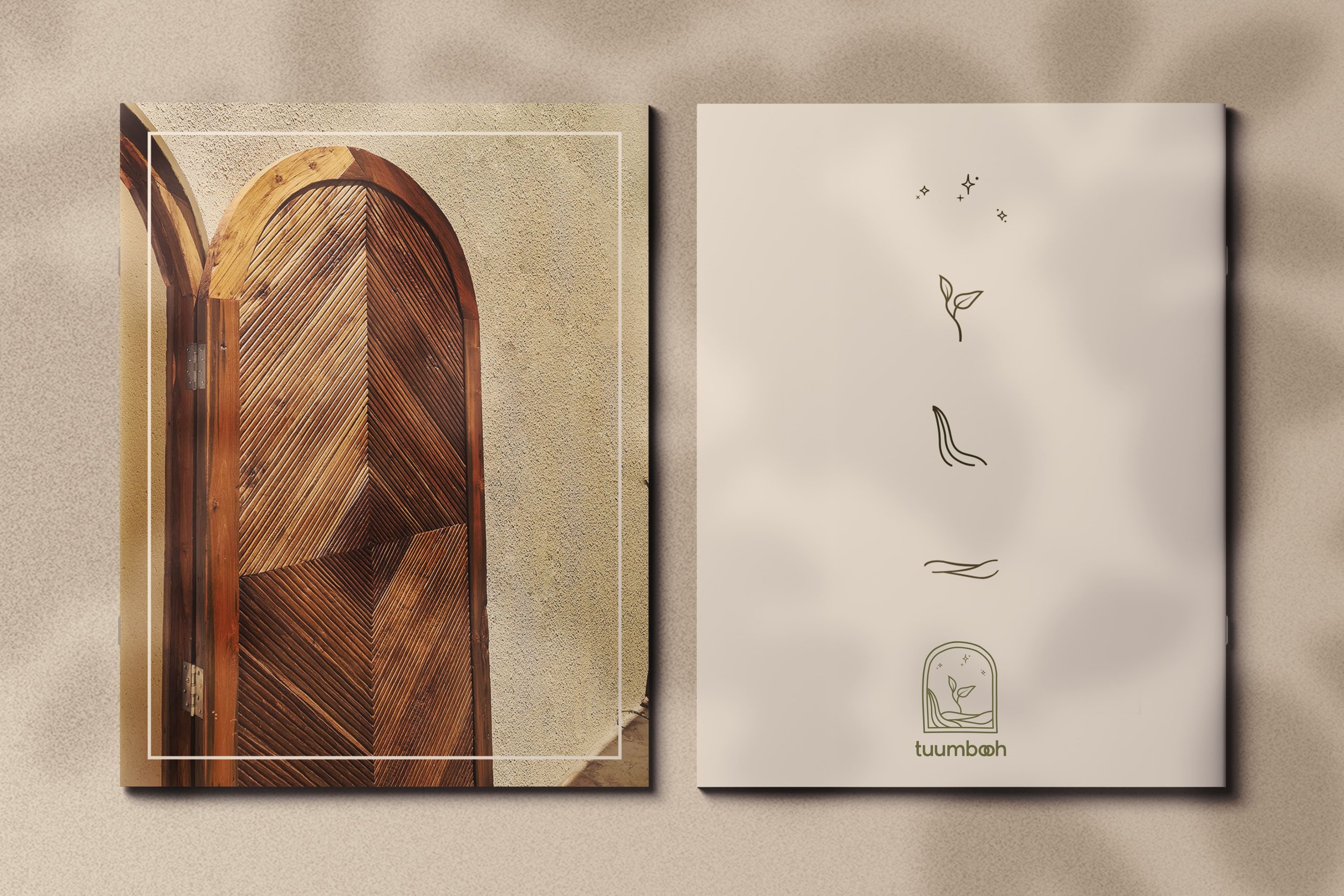
The logo comprises four key elements: 'langit' (sky), 'air' (water), ‘bumi’ (earth), and 'benih' (seed). These elements come hand in hand to nurture a seed into a plant that sustains life for humans. The logo also reflects the company's name, signifying growth, whether in the literal sense of nature or the continuous expansion of the company each day. By blending various elements, we present a complete cycle of nature simply and cleanly.
Focusing on nature and plants, the brand employs two main colors: white and green. White is applied to the logo and logotype, while green serves as the background and establishes the overall look for other materials. White symbolizes the simplicity and tranquility of tuumbooh, while green accentuates the nature concept.
tuumbooh logotype is crafted using a carefully selected bold sans-serif font to create a friendly appearance. This font gently portrays friendliness through its simple design, and rounded letter forms.
The double 'o' in our logo is designed to resemble an infinity symbol, with the hope that tuumbooh will never cease to grow, much like our aspiration for nature to continually flourish, supporting human life without ever stopping.
To foster the growth of tuumbooh's audience, we've crafted social media templates for their Instagram account. With a strong emphasis on simplicity and inspirational island vibes, the templates aim to appear vibrant and emphasize the visuals, whether they be pictures or videos used in the content.