


Fact vs Fitness is an online resource that helps people discover and solve their histamine intolerance. Anita, the owner, and the company’s nutritional scientist approached us to design their new Histamine Intolerance Modules for future customers who buy/sign up for their Histamine Intolerance Webinar.
Anita had some digital presence but she wanted us to make their brand look to be more friendly, and approachable yet still engaging—starting with these presentation designs.
This is the Fact vs Fitness current logo. It has an icon that is memorable and easy to work with. We use it on the presentation as a brand identifier, but adjust the colors to fit the approachable, friendly feel that the client wants.
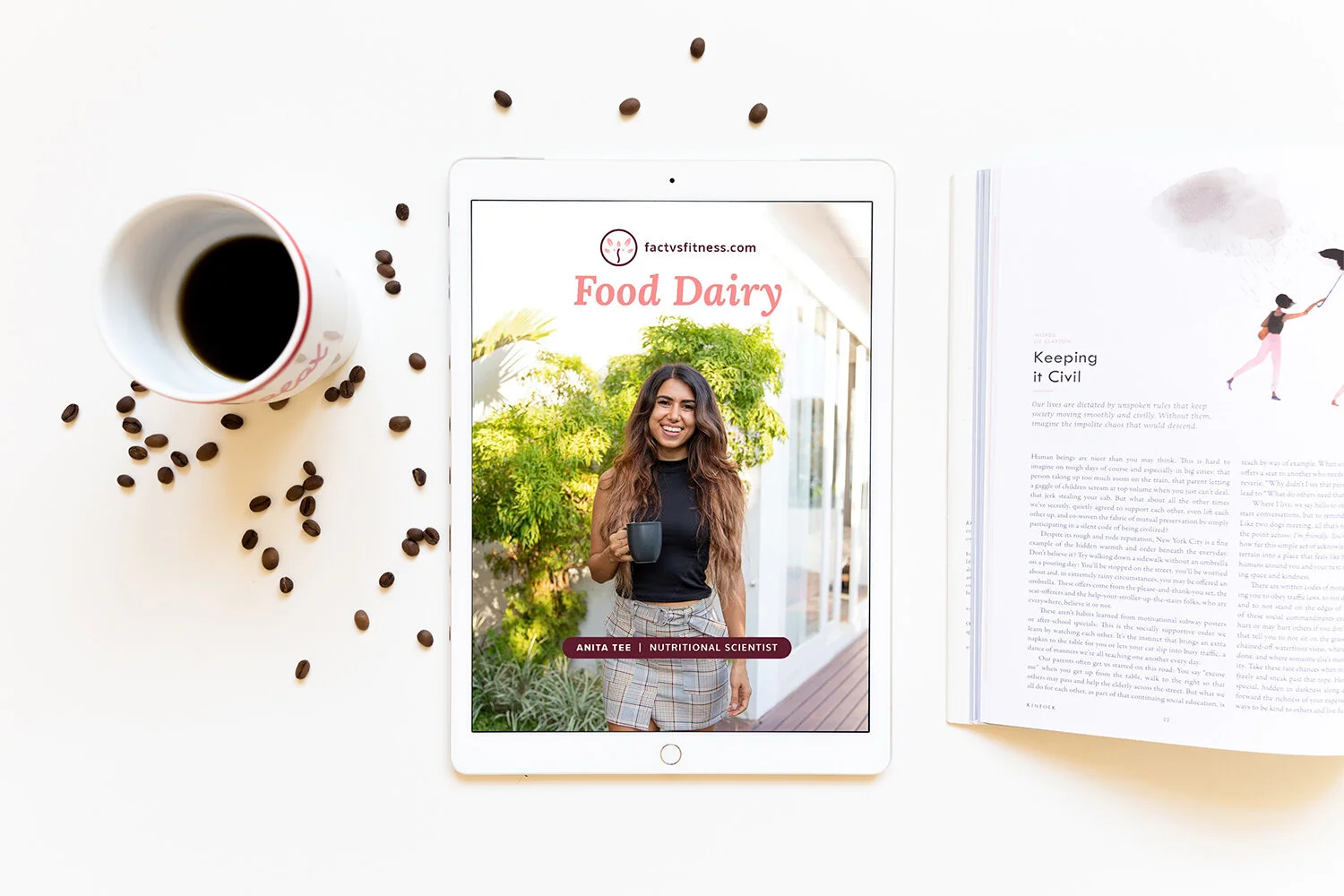
We use casual, relevant, and captivating imagery for the presentation, and we create a typography hierarchy for the information based on its importance. The client is so delighted with these designs that she wants to refresh all of her collaterals using our service.
We use the presentation design as the guide for Anita’s other collateral designs. Here, we design her Low Histamine Diet Guide, Food Dairy entry, and Supplement Guide. These are all in PDF form. We aim to create the PDFs digestible and interesting to read.
I hope you enjoyed viewing this project. Check out our Fact vs Fitness interactive cookbook designs!