


Food Cycle Indonesia is a not-for-profit organization that repurposes leftover food from restaurants or events which is still fit for consumption and offers it to those in need.
They have a subsidiary brand called Food Cycle Kitchen (FCK), which utilizes raw food waste to produce high-quality food items for sale to the general public, with the profits being utilized to fund the operations of Food Cycle Indonesia.
We were motivated by their objectives and chose to enhance the Food Cycle Kitchen brand identity to extend its reach and accomplish the same goal of reducing food waste.
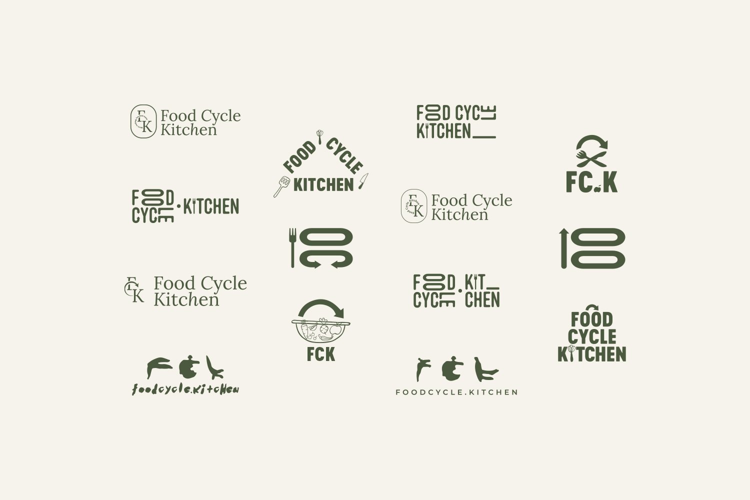
Ecada Creative takes pride in our research process and how we came up with the idea for the Food Cycle Kitchen brand concept.
We explored various elements, stories, and looks suitable for Food Cycle Kitchen's new identity.
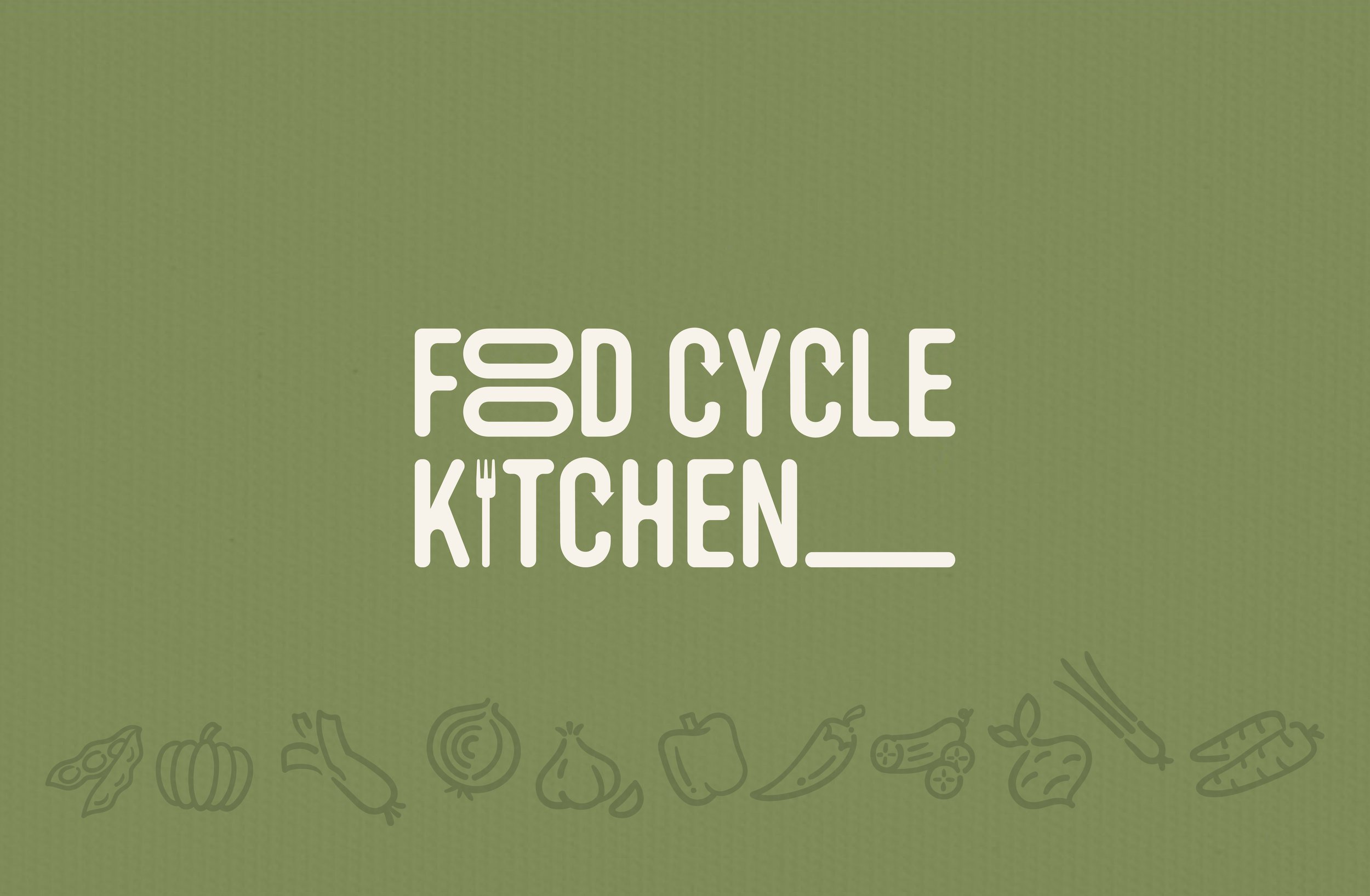
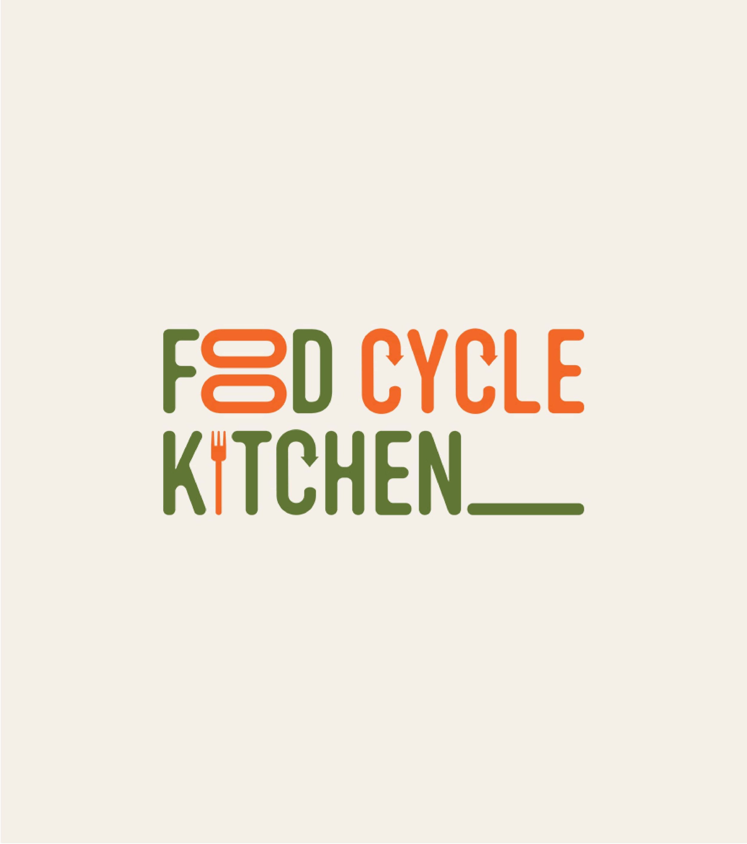
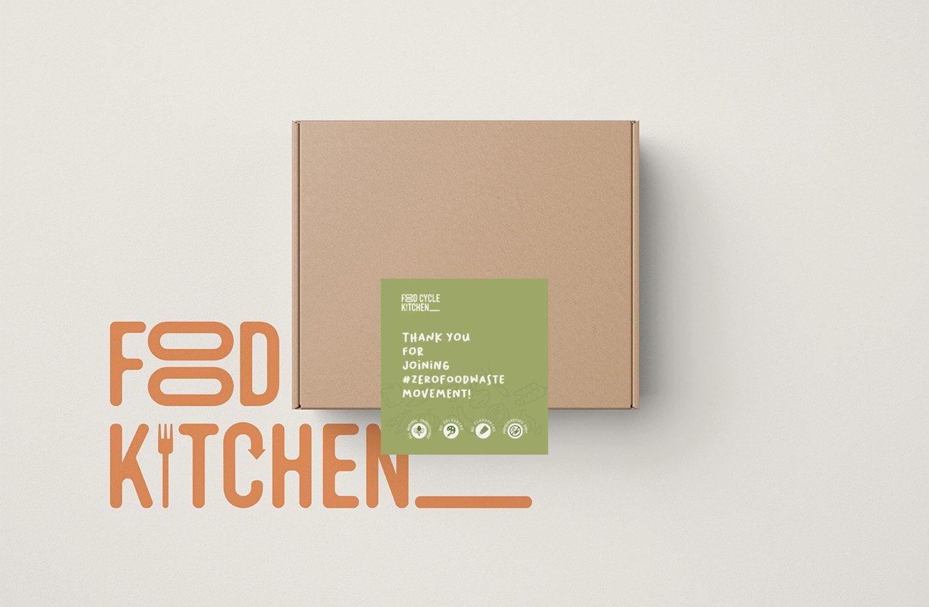
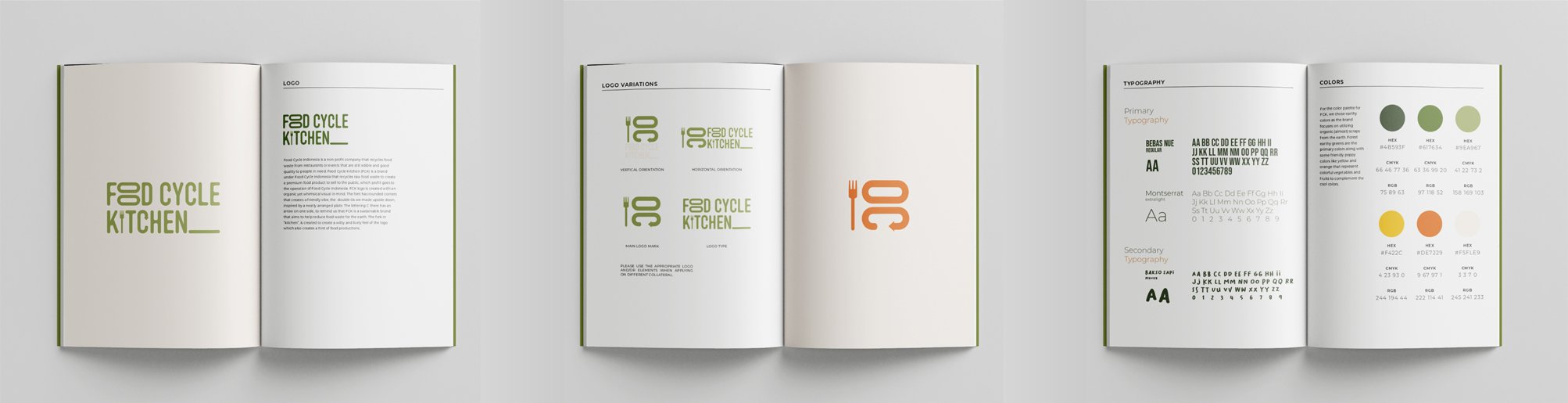
Food Cycle Kitchen logo is created with an organic yet whimsical visual in mind. The font used has curved edges that evoke a warm and approachable feeling, and the two 'O's have been flipped upside down to resemble a neatly arranged dish.
The letter 'C' incorporates an arrow on one side to serve as a reminder that FCK is committed to sustainability and aims to minimize food waste.
The fork incorporated into the word "kitchen" adds a playful and energetic touch to the logo, while also suggesting a connection to food preparation.
The brand's emphasis on using organic leftovers from the earth influenced our choice of colors for the palette.
We opted for earthy tones, particularly forest greens, to reflect this focus. In addition, we included warm shades like yellow and orange to represent vibrant fruits and vegetables that complement the cool tones.
In selecting fonts for Food Cycle Kitchen, we opted for three different ones. Two of these fonts were chosen for use as primary typography in the logotype.
As for the secondary typography, we selected a handwritten font to add a personal touch, emphasizing the human element of food creation and fostering a friendly atmosphere. This font will be used for other written content that appears in the brand's visual elements.
The design of Food Cycle Kitchen aims to convey a welcoming and peaceful atmosphere, with colors that evoke a connection to nature, which is central to the brand's mission.
Our hope is that viewing any of the items associated with Food Cycle Kitchen will serve as a reminder of the brand's objectives and the importance of caring for our environment.
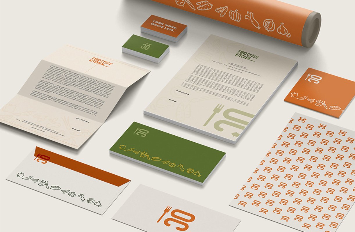
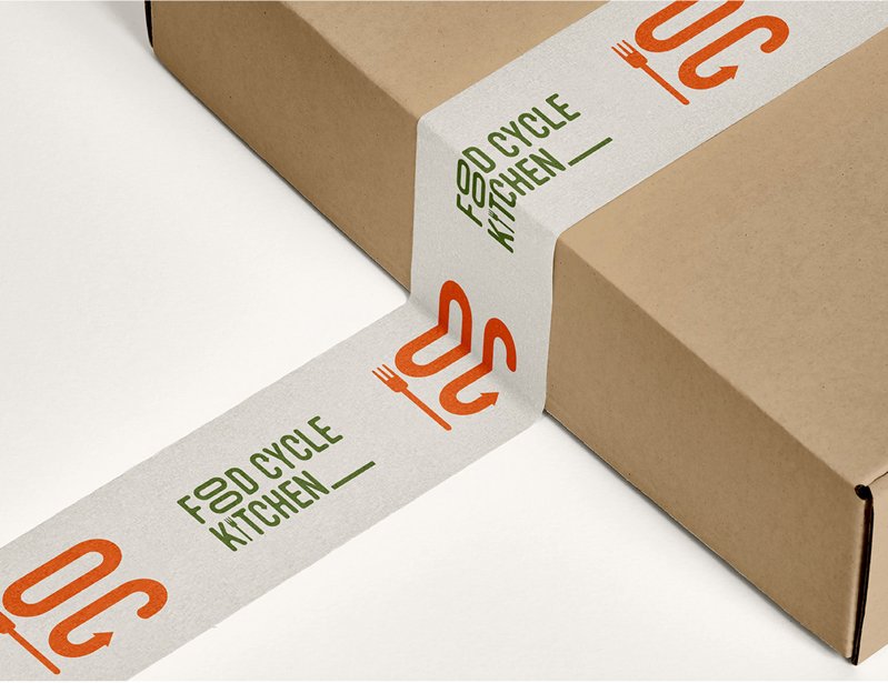
In order to fully establish the brand identity, it's important to pay attention to small details like greeting cards and logo stickers. That's why we take care to include these elements in our branding efforts.
We created a packaging label for Food Cycle Kitchen's new product, the Spicy Marinara Sauce. The label's primary color remains earthy to align with the brand's overall palette.
However, we also incorporated deep tomato red color to represent the marinara sauce itself, which appears in the text on the label.
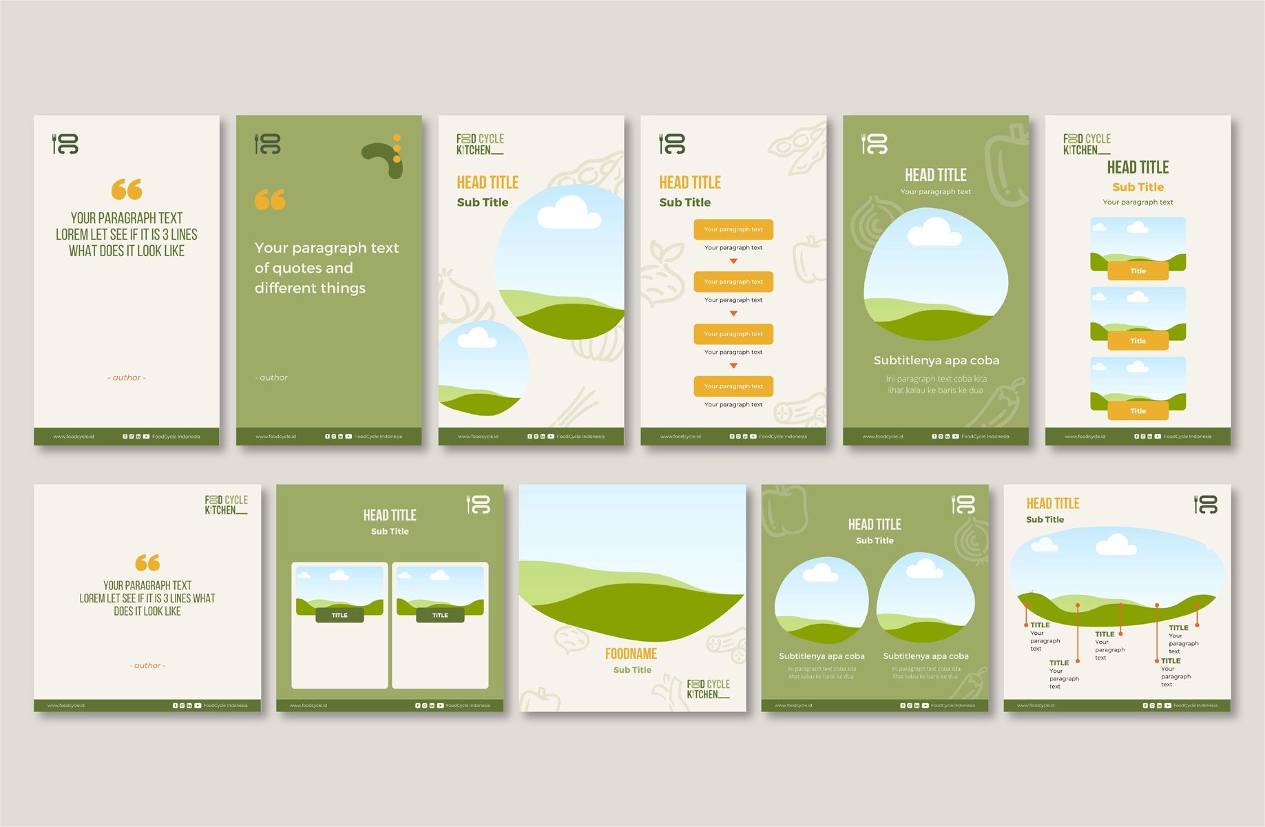
We designed a social media template for Food Cycle Kitchen, which includes a diverse range of designs, from quote templates to list templates.
To ensure brand consistency across various platforms, we incorporated organic shapes and earthy colors in the designs.
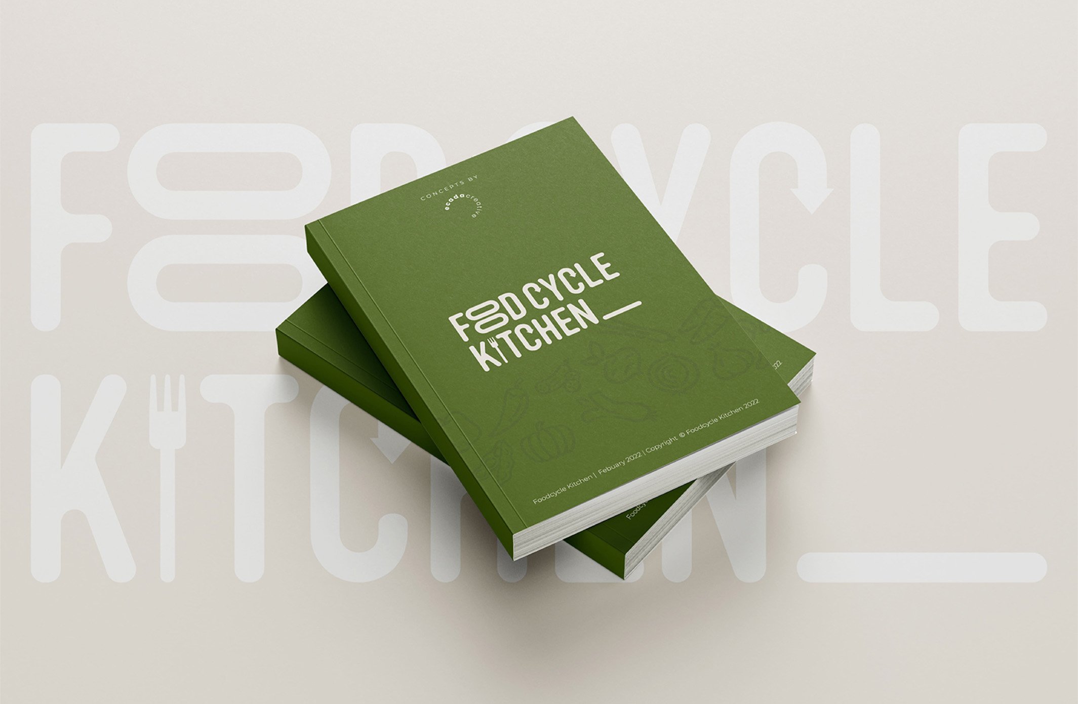
Finally, we developed brand guidelines to ensure that the elements of the brand identity are used correctly in the future. This is crucial for maintaining the brand's visual integrity and preventing any misuse of its visual elements.